
Offering harsh scrutiny in these scenarios might seem nitpicky, even mean. But holding ourselves and the design community to a higher standard of UX and UI design will only result in better product design. Let’s begin with the irritating and move towards the seriously upsetting.
We’ll highlight the mistakes and offer suggestions of a healthier way forward.
Phone Locks: a necessary evil
Phone locks are a handy feature:
- They add that extra layer of security to keep your friends from posting embarrassing comments using your social media accounts
- They stop folks from tapping into your financial applications, and serve a host of other protective purposes.
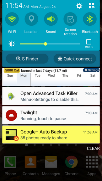
Unfortunately, they also hold up important processes when you’re trying to use your phone. The worst is when you’re in the middle of a phone call, and the phone’s screen locks.

The <3 of EU tech
The latest rumblings from the EU tech scene, a story from our wise ol' founder Boris, and some questionable AI art. It's free, every week, in your inbox. Sign up now!
If you’d like to switch to speaker, put on your mute button, switch over to a new incoming call, or just hang up—you’re forced to go through the process of sliding to unlock and then entering a passcode before you can access the phone call interface that you’re already using.
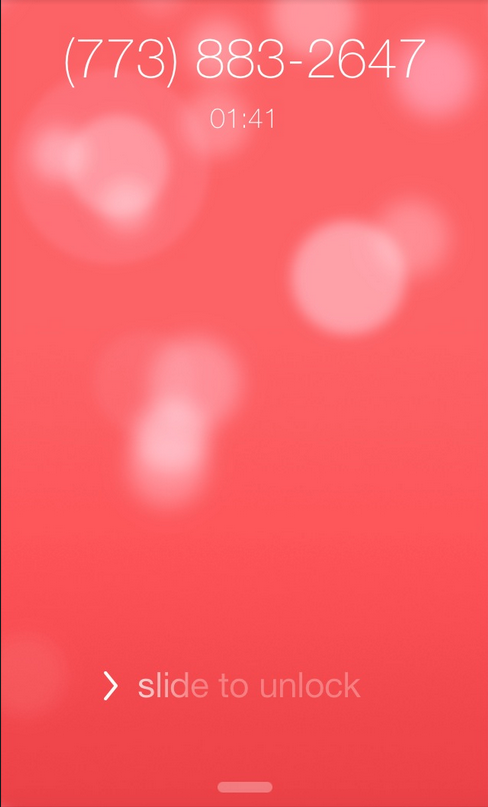
Screenshot via: http://sloppyui.tumblr.com/image/64931591153
It’s a minor inconvenience, but worth mentioning if you’ve missed as many calls as I have.
A practical solution would be to simply suspend the phone’s screen lock during a call. It’s obvious that the phone is already in use, so why bother securing it against micro-interactions within an ongoing process?
Overly Complex Password Protections
Password protections are notoriously irritating.
Most folks only have one that they end up complicating according to the site requirements. Requirements, which by the way, seem to get more ridiculous every time you’ve got to set a new password. A capital letter, a lowercase letter, a special character, nonsequential numerical values, a reference to a presidential candidate who ran between the years of 1789 and 1852.
Well, maybe we’re exaggerating a bit, but you get the idea.
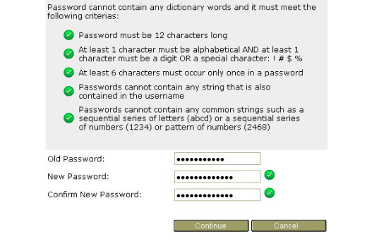
Photo credit: US Census Bureau
While it’s nice to think that your password is made much safer by replacing your “s” with a dollar sign or your “I” with an exclamation point as you alternate between capital and lowercase letters, you’re mostly just making it more difficult for yourself to remember the insanely complex passcode.
Memory mastery isn’t exactly a common skill. The human mind has a lot of trouble with that sort of complex recall, especially in regards to something we would consider a formality (such as a new password that you’ll most likely have your browser save for you immediately).
It’s difficult enough to remember what’s on our immediate schedules, never mind the intricacies of an enigmatic password that we need to change every month or so anyway. And to top it all off, there’s evidence to suggest that these added levels of complexity don’t result in that much added security.
Password cracking programs can process thousands of different character combinations in seconds. Phonetically viable words, even when strangely composed with special characters, are still vulnerable to brute force attacks on your security. Even so, it’s extremely common for a service or subscription to force users into creating an impossible to recall password.
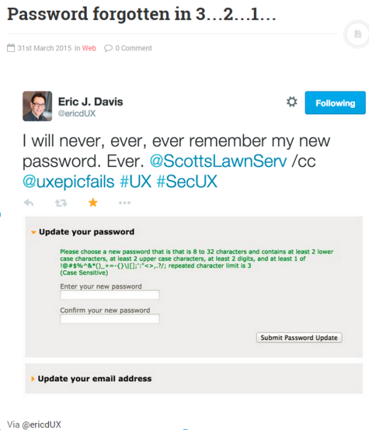
Screenshot via: http://www.uxepicfails.com/ux-epic-fails/password-forgotten-in-3-2-1-1013/
If, on the other hand, you were to simply make a password longer and slightly more random, you’d be much better protected due to the increase in variables that a brute force attack would have to guess. In fact, three or more random words creates a much more memorable (and secure) password as shown here by XKCD.
Long Forms with Quick Resets
Forms are often a source of contentious UX faux pas.
Certainly, you need to collect some information, but you must carefully select how much information you ask for. Long forms are a major turnoff. Long forms with asterisks next to seemingly inconsequential information are even worse. Long forms that have a reset button that’s dangerously close to the continue button? Now that’s a recipe for immediately ruining any and every sort of positive UX.
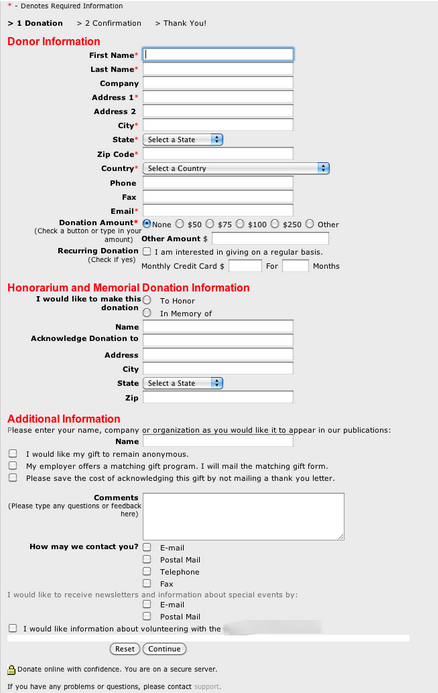
Picture via: http://24.media.tumblr.com/tumblr_lptw82wRBG1r02bp9o1_1280.png
Be conservative with the chores you give your users. Too much work is a sure way to reduce the number of conversions. And if that much info is absolutely necessary (and it probably isn’t) then make sure you eliminate any opportunity the user has to accidentally erase everything once they’ve finished.
As recommended in Web Design for the Human Eye, don’t be afraid to chunk out your information into multiple steps. If you can’t avoid a long form (like ecommerce or travel sites), then pace out your form over a few pages rather than all at once.
Deceptive Imagery
Are you ready for your tropical vacation? Err… I mean, haircut.

Screenshot via: http://www.headhunterhairstyling.com/
Users react to visuals faster than text, so always make sure your content matches the supporting visuals. The best method is to let your content inform your design. Imagery, though it’s the first thing a user sees, should be a secondary concern in your mind, until you’ve decided what information is most important to the user. The imagery needs to emphasize or complement the content, not overshadow or replace it.
For example, Airbnb’s new interactive map does this very well. The map illustrates how active Airbnb customers are all over the world, and encourages the user to interact with the design to learn more about the business. For your designs to do the same, examine what’s special or unique about the work in question and look for imagery that highlights the content.

Automatic Cloud Uploads
Since we’re already on the topic of privacy… Do you remember all the naughty pictures of celebrities that were swiped from the iCloud by hackers last year? Yeah, that’s a pretty drastic example of UX gone horribly wrong.

Image via: https://upload.wikimedia.org/wikipedia/commons/thumb/9/97/CENSORED.svg/2000px-CENSORED.svg.png
Once more, this is actually a critique on almost every smartphone/mobile provider because both Android and Apple have automatic photo/video uploads to remote cloud servers set as the default. Not only that, but if you turn this setting off, you’ll be constantly reminded you that you have photos or videos that aren’t backed up on your phone’s hard drive.
The worst part of the debacle is that many users have no idea their data is being saved anywhere besides their phones. The auto-backup feature was never advertised, it was simply a default setting that very few users ever even came across.
This was a UX fail on multiple levels:
- No transparency
- Limited choice
- Immensely dissatisfactory security.
Unfortunately, this concluded in a massive breach of privacy for our most beloved starlets, and a general reminder of how very deviant a place the internet really is.
Overly complex interfaces
When dealing with an interface so complex that a young woman loses her life because trained medical professionals couldn’t figure out the interface…well, you start to grasp the importance of good design.
Screenshot via: https://medium.com/tragic-design/how-bad-ux-killed-jenny-ef915419879e
According to an article by Jonathan Shariat, a young woman who had been undergoing chemotherapy died of complications due to an oversight in her post treatment. She wasn’t properly rehydrated after chemo and died as a result. The nurses on duty knew that she needed to be rehydrated, but were unable to navigate the complex UI in the program that was designed to keep track of the patient’s treatments.
Software needs to be simple and intuitive in order for people to accomplish their given tasks with minimum difficulty. When working in the medical field, specifically, a simple, pleasurable, and functional UX can literally save lives. So if you were ever questioning the overall importance of your work in the field, there’s some added incentive for you to put forth your best efforts.
As described in Web UI Best Practices, minimalism is much more than just a visual aesthetic. When you strip away your interface to focus on the content, the entire system becomes more usable. Remember that findability is always a priority, and the more distractions are present to users, the more your interface needs to be “chunked out” for quick scanning. This is part of the reason why grid-based designs and card interfaces have become so popular.
Conclusion
UX failures can range from the funny and inconsequential to the outright tragic. Be sure to simplify whenever you can.
To learn more about how to design better UX, check out the free e-book Interaction Design Best Practices below. Across 100+ pages, you’ll better master the fundamentals of UX design with analyzed examples from 30+ companies.
Read Next: 6 storytelling techniques for great interaction design
Image credit: Shutterstock
Get the TNW newsletter
Get the most important tech news in your inbox each week.