Someone writing a letter to their therapist in the Freud’s handwriting: That was the image that inspired German typographic artist Harald Geisler to develop a typeface based on the famous psychoanalyst’s script. His vision became a reality following a successful Kickstarter campaign in 2013. He says:
It motivates me, because the process is very long, to have that image in mind. With Freud, it was that funny idea that someone could write a letter to their shrink in Freud’s handwriting, to reverse the authority. Now a lot of psychoanalysts I know use the font.
One psychology student in Australia even contacted Geisler for help on getting a sentence from Freud’s works as a tattoo, wanting to ensure that the German handwriting would be rendered with maximum accuracy. “That was a surprising outcome,” the artist comments with particularly Germanic dryness.
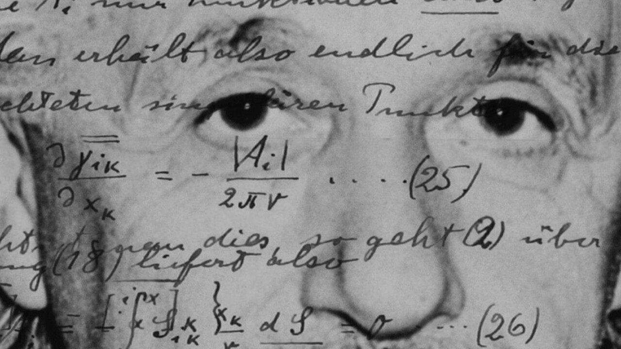
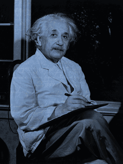
Harald Geisler has become the man who breathes new life into intellectual icons by turning their handwritten texts from archives into living typefaces. His follow-up to the Freud font is one based on the writing style of Albert Einstein – conceived in partnership with the dancer Liz Waterhouse, and approved by the Einstein estate.
The Einstein font has understandably garnered a huge amount of press coverage across the world. The physicist’s general theory of relativity made him a titan of science, but it’s also his abiding place in pop culture that fuels interest.
I wanted to talk to Geisler not just about the Einstein typeface, but about the philosophy behind creating fonts based on handwriting, and the actual physical process of creating them.
He was very generous with his time, even as he works to create the final version of the Albert Einstein typeface – an early version of which you can see used in this article’s sub-heads.
First, I asked the artist what led him to work with typography. He chuckled, “You know, no one has ever asked me that before!” It turns out his interest was sparked by a more modern influence:
I recently found an old floppy disk in my parents’ attic, which has graffiti letters on it. I drew them in Illustrator on the Macintosh then put them into font format. I never published the font, but I should somehow get a disk drive and connect it to my computer to see if I can now.
Though he appreciates the work of other font designers, he approaches the process quite differently:
They create very, very complex systems and it takes years to create a typeface. I like to do a typeface in a day, which is very pleasing to me. I do it and I don’t have to think much. I turn off my aesthetic instinct and follow what is in front of me
…I try to stick as much as possible to the origin. I remember when I was developing the Freud typeface that some letters were so ugly. But while it looks ugly as a single letter, when you put it together with others on either side, it suddenly looks right.
It makes sense that Geisler is working with a dancer. His work is about trying to capture and inhabit the way his subjects’ moved and how that translated to the page. He explains:
It gives me an intimate insight into how the person moved on paper. Sometimes I have to copy letter combinations and mimic them. I repeat them until I understand how the person probably made that combination. You become like an actor, and when you do it long enough you get into character. It gives me an illusion of how they might have thought.
The word ‘illusion’ is key though:
I copy his equations, but content wise, I’m far from understanding what is there. There is an illusion of understanding, but in a way, that’s also how life is: You know a person for 10 years and suddenly they do something quite unexpected.
On the project’s Kickstarter page, Phil Marshall, a physicist at the Kavli Institute for Particle Astrophysics and Cosmology at Stanford, effectively sums up the appeal of the typeface to scientists:
While producing documents in Einstein’s handwriting would not alter the quality or respectability of my own physics research, there’s something very pleasing about representing the universe in the same style as someone who was himself so effective at it… Einstein’s equations were beautiful, so it makes sense their presentation should be as well.
To achieve a typeface that goes beyond conventional ligatures – the way fonts generally realise a combination of two or more letters – Geisler has developed an approach he calls “polyalphabetic substitution” – creating four alternate versions of each letter that switch as you type.
That’s necessary to make a typeface that more realistically mimics the handwriting from which it’s derived. Geisler reaches that point after lengthly research using documents from his subjects’ archives, isolating letters that he finds “not necessarily beautiful, but typical of the author’s hand.”
He uses a Wacom Cintiq to draw the glyphs, and rather than owning a laptop, throws his Mac Mini in his carry-on luggage when he travels.

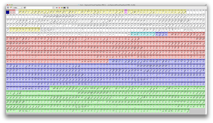
To create the Freud font, the artist produced 1,467 different glyphs that are used to render the text. He will produce five complete sets of lower and uppercase letters, numbers, punctuation and accented letters for the Einstein typeface and a full complement of Greek characters along with other scientific notations.
He explains that there were marked differences between the sources available for Freud and Einstein:
With Einstein, he travelled throughout America. When he did that, he was writing with a pencil and not writing science. He was talking about his experience of travelling. The character of his handwriting is there, but it is much more relaxed.
I also took from two papers that were meant to be sent to a publisher, to be publisher in a scientific journal. There had already been a lot of thinking, but he needed to make clear copies. I needed a lot of upper and loser case letters. Luckily, in German, a lot of letters are capitalized. Try finding a capital ‘Q’ or ‘X’ in English. That’s very difficult.
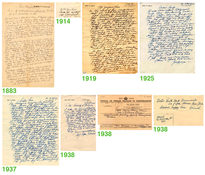
Where Einstein’s work gave Geisler access to lengthy texts, developing the Freud typeface relied on a much smaller corpus of work:
I didn’t have access to longer scripts. With Einstein, they go on for 20 pages or more. For Freud, I just had letters. I focused on a series he sent to his grandson. I imagined that when he was writing those he would have been in a lovely mood. I also had to take some glyphs from other letters, however.
The way both men wrote also has a bearing on the way the typefaces respond to being used to write English. In a way, their accents are present in the finished product:
With Freud, it’s very easy to write in English with the typeface, because he also wrote in English and when he quotes people in English, he switches from German to Latin handwriting. He kind of had specific English and French handwriting.
Einstein always used Latin handwriting, but the letter combinations in German are very different. With Einstein, when he spoke English, you heard the German accent.
The Albert Einstein font is on course to more than triple its initial $15,000 Kickstarter goal, meaning that Geisler and Waterhouse will definitely be able to deliver the project.
Waterhouse and Geisler’s next famous subject for a handwriting font will be a woman, but the artist isn’t willing to reveal who it will be quite yet:
The image I had in mind was of a table where Einstein and Freud are sitting and next to them there’s a place for a woman. Who is going to sit there? In the beginning we thought about Marie Curie or Marie Antoinette or maybe Queen Elizabeth or Hilary Clinton, Margaret Thatcher, other female leaders. But then Liz came up with a much, much better idea. It’s going to be a very big surprise.
Beyond the next famous handwriting font, Geisler is pondering the future of typefaces. In an excellent article for Smashing Magazine on the creation of the Freud typeface, he put forward the idea of children creating their own custom typefaces that evolve as they grow. He explained the idea again to me:
Instead of simply writing, they would start building their own font. As you grew and learnt, you would adapt and change your font. In time, maybe you would adapt your personal font. It would be a very cultivated thing.
Along with the philosophy, he is exploring how technology might play its part in this future world of typography. On the day I interviewed him, he had just been in talks with a firm that builds robots that can compose handwritten notes. “Just imagine,” he said, “a hall of robots, all moving in the same way Einstein used to write.”
Image credits: Harald Geisler | ALBERT EINSTEIN and EINSTEIN are either trademarks or registered trademarks of The Hebrew University of Jerusalem. Represented exclusively by Corbis.
Get the TNW newsletter
Get the most important tech news in your inbox each week.