
There were doubters when flat design started emerging, but this design trend isn’t going anywhere anytime soon. Flat design is only getting started and is more popular than ever when it comes to mobile UI design.
The principles behind this design technique are so universally — and aesthetically — pleasing that some of the biggest companies in the digital sphere, including Apple and Google, have adopted design frameworks with flat philosophies in mind.
Flat design works, simply because it is adaptable, which makes it perfect for mobile-first design. Unlike in the early days, where designers argued that flat design had to follow a more strict set of guidelines, flat design is now much more usable with tasteful touches of skeuomorphism (see flat design 2.0).
With that, let’s dive into how flat design is a match made in mobile heaven.
First, a Flat Design Primer

The <3 of EU tech
The latest rumblings from the EU tech scene, a story from our wise ol' founder Boris, and some questionable AI art. It's free, every week, in your inbox. Sign up now!
By now, flat design has become an almost “household” term. But in case you aren’t 100 percent familiar with the concept let’s take a quick review of what makes for a flat design.
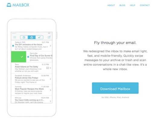
Photo credit: http://www.mailboxapp.com/
Flat design started as a reaction against the skeuomorphic aesthetic that dominated mobile design, particularly the Apple iOS of the early iPhones.
Back in those early smartphone days, it was necessary to have things, like buttons, more accurately mirror their physical world counterparts so that we understood how to interact with the device. Nowadays it’s old hat and we no longer need metaphorical visual cues everywhere to navigate our way around a mobile device. Hence, flat design grew in popularity — more so once Apple made the switch with iOS7.
But, as first described in the free e-book Web Design Trends 2015-2016, flat design is evolving. Some of the characteristics listed below have been part of flat design from the beginning. What has changed and is still continuing to change is that stringency of these design rules. We are now seeing “almost flat” design, or what Ryan Allen terms “flat 2.0”. All the flat but with some eye-catching enhancements, such as hints of shadows and color.
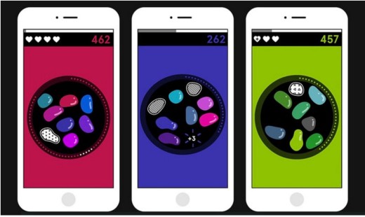
Photo credit: http://playspecimen.com/
The mobile game Specimen is a good example of flat design with these bits of shadow and color. While the design is certainly flat, it is far from skeuomorphic even though it isn’t afraid to embrace a few select elements.
Let’s take a closer look at some mobile flat 2.0 characteristics.
- Lack of over-embellishment: Design techniques such as drop shadows, gradients and other decorations are usually left off of elements. Although with “flat 2.0,” as seen in the example above, we’re seeing these return in more subtle ways.
- Distinct color palette: Flat design colors are characterized by bright, fully saturated hues to make up for the austere visual embellishments. Palettes are commonly monotone or fall to the other end of the spectrum with a wide array of color choices.
- Simple elements: Elements are designed in simple shapes and with simple structures, including rectangles, circles and squares. Minimalism is the order of the day. This allows for more content-focused design and “invisible” interfaces that don’t distract from user tasks.
- Strong focus on typography: Because flat interfaces are inherently minimalist, typography becomes a dominant visual element. For a bold yet elegant aesthetic, type choices are often simple sans serifs with thin to medium weights. Oversized typography and all caps are popular choices to create more contrast and emphasis.
- Less is more approach: Everything about flat design follows a philosophy of “less is more.” These design often lack photographs and flourishes. They include plenty of space, but not a lot of elements.
You can find a full primer on flat design concepts and techniques in Web UI Trends Present & Future: The Evolution of Flat Design.
Flat Was Made for Mobile
Why flat? What makes it such a popular option when it comes to mobile design?
Because it works.
Regardless of which device or interface you are designing for, flat design is a tool that helps you check many of the boxes when it comes to the dozens of mobile design specifications out there. Because of the smaller screens (although they seem to be getting larger, elements such as space and contrast are of utmost concern.
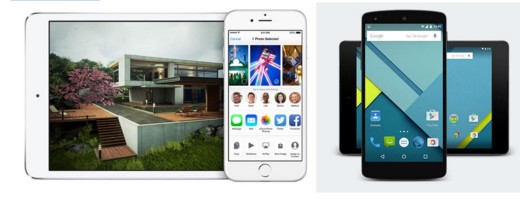
Photo credit: Apple and Google
Flat design helps alleviate concerns about limited space, especially since the focus is simplicity and minimalism. This is arguably part of the reason why all the major phone operating systems use a flat design aesthetic. Just look at Apple’s iOS, Android and even Microsoft — all flat. The use of this design style and patterns creates a common visual language for users, so that they can move easily from device to device, operating system to operating system.
The most obvious use of flat characteristics are space, typography and color. Both Apple and Google aesthetic guidelines come back to flat design without saying it. Because some of the biggest names in the industry are doing this, designers are inclined to follow suit.
Flat design also fits well into responsive frameworks and mobile-first design. Mobile-first design is a process for fulfilling responsive or adaptive design in which you first tackle the smallest screen experience. By scaling up from mobile rather than degrading downwards, you ensure a consistent experience regardless of device.
Photo Credit: http://www.micelistudios.com/
There are usability perks as well. Because flat outlines tend to be rather simple and lightweight, load times aren’t as much of a concern. Fewer and smaller elements won’t bog down a site. When you arrange a flat interface using a common cards-style pattern, you also find that the layout is much easier to adapt to multiple breakpoints (you’re essentially playing around with rectangular content containers). Users adapted to the style quickly and now also understand how elements such as ghost buttons, icons, simple color and text buttons work.
One last point, flat design has been shown to help with leading users to take action. When a flat button was used conversions for Underwater Audio jumped 35 percent.
Let’s briefly recap the advantages of flat design for responsive and mobile-first design:
- Colors appear at a better resolution since they are generated in-browser (very important considering the rise of HD devices and monitors like Retina)
- Content-driven interface is perfect for mobile users with short attention spans. Less obstructive interface allows for faster skimming.
- Simpler to re-arrange for breakpoints. With more skeuomorphic interfaces, you create a “physical” interface that must be broken down and rebuilt at different screen sizes. With flat interfaces, it’s more a game of moving around elements in a fluid medium.
- Easy for users to understand and navigate thanks to the inherent grid-like visual organization
- Speedy loading times since elements are simpler and browsers generate colors instead of downloading to the device
It all comes together for a simple reason – flat design is a trend that has been evolving from Day 1. Designers have found ways to use it for complete frameworks, incorporate flat concepts into other major design styles or use elements of flat design as accent pieces.
The Evolution of Mobile Flat Design
Flat design is not nearly as flat as it was in 2013. As we said before, tweaks made to the concept have made it more functional and aesthetically desirable for designers.
Flat 2.0 is fixing some of the early complaints about flat design and giving designers more breathing room and visual maturity.
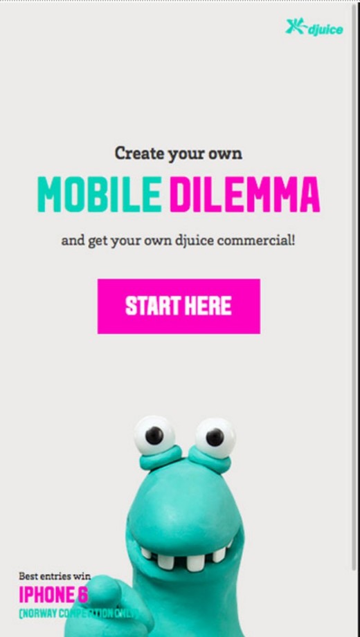
Photo credit: http://mobildilemma.djuice.no/en
Flat design really began to open designers up to using more space again. This is vital when it comes to mobile design:
Users need room to interact with elements. They need to be big enough, and separated enough, from other elements so that the user engages with the right element each time. Remember to design for fat fingers.
Refocus on readability. Simple typography always helps improve readability. This might be one of the biggest benefits of the trend long-term. Font selection and contrast is a major topic of consideration with every design project. Is the typeface too thin, too small, too condensed? At the end of the day, if your design isn’t readable, then it’s not usable.
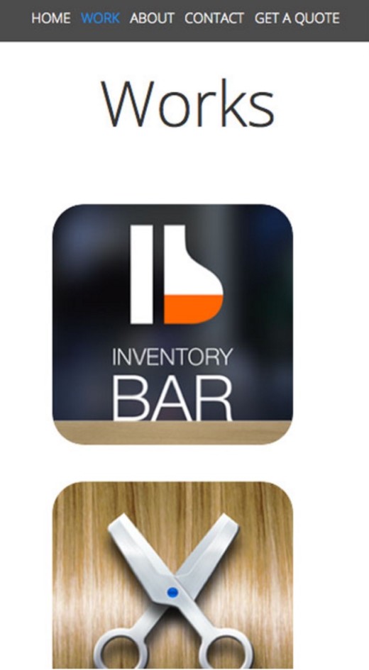
Photo credit: http://omega-r.com/
Today’s flat design does include some slight embellishment. Subtle gradients and drop shadows are part of many flat outlines. Color palettes have evolved to include more colors and not just those that were deemed flat. Flat design has grown to include elements such as photography and animation as those elements have grown in popularity, as well.
Flat and Other Design Techniques
As explained in Mobile Design Trends 2015 & 2016 by UXPin, flat design has evolved to integrate with a number of other design styles and patterns. It no longer exists in a vacuum.

Photo credit: http://www.aa.co.nz/
Flat and hero images: Full-screen images are hot. Paired with flat concepts such as bold typography and simple button structure, you get a design that layers flat elements over strong photography. The key to full-screen images is adding simple typography. Discover the AA (above) uses a strong image with plenty of room for text elements. It also adds a colored bar as a quick link for what is likely their most important tool.
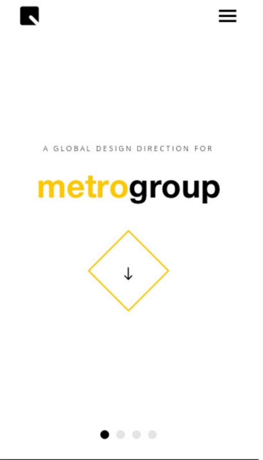
Photo credit: http://tapunit.com/
Flat & minimalism: Flat design is a minimal concept in its own right, and works exceptionally well when stripped down even further in minimally-designed frameworks. In the above example from the Metro Group, the white space tells users where to look and what to do. Simple color choices further emphasize calls to action.
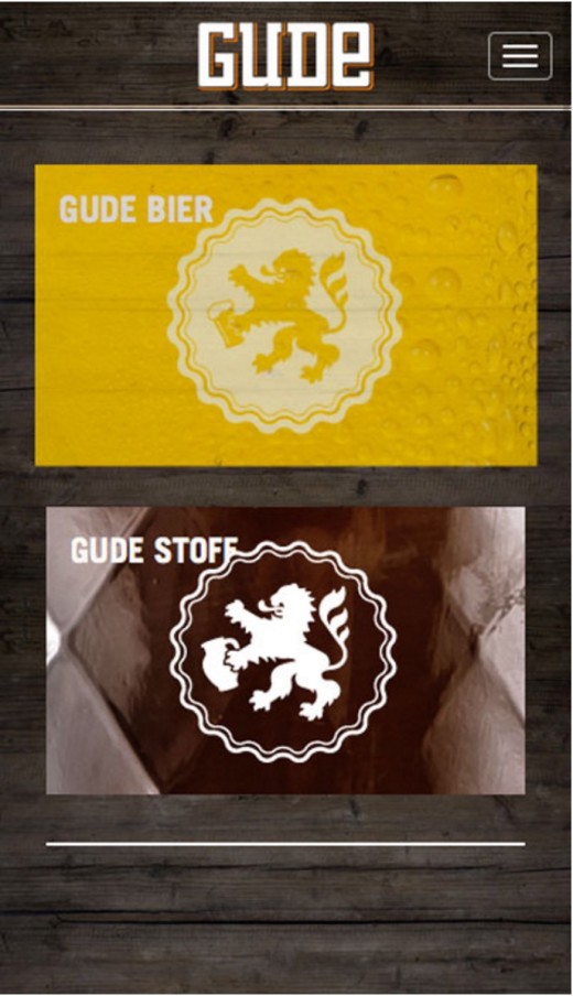
Photo credit: http://www.gude-stoff.de/
Flat and animation: Many gestures trigger some type of animation, creating a delightful microinteraction. From animations as simple as hover effects to interactive elements that move dynamically in game play, animation and flat work together seamlessly. Gude (above) provides simple visual feedback by expanding the image when you tap upon it. If you’d like to create your own mobile microinteractons, feel free to play around with our custom animations editor. Always follow the 12 rules of animation.
Benefits of Flat Design for Mobile Interfaces
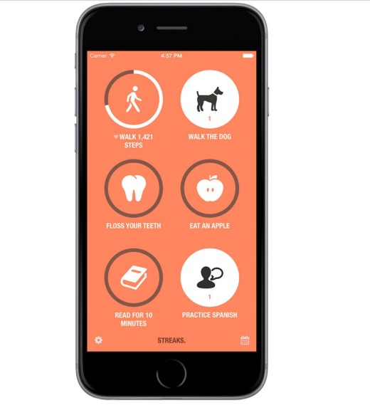
Photo credit: http://streaksapp.com/
The benefits of flat design are pretty universal whether you are designing for a mobile site, app or desktop site, as detailed in The Evolution of Flat Design.
- The visually organized interface works well with responsive frameworks
- Minimalist, simple style is easy to browse for users
- Clean yet vibrant color palette is highly engaging
- Graphic icons are fun and easy to understand
- Bold lines and shapes express a logical, almost architectural feel
- Simple pieces and elements are quick to load
- Typography is designed for readability
We can expand the list to include a few more distinct benefits specific to mobile devices and users, as well.
- Style translates well to small screens while retaining its impact on bigger devices such as phablets
- Space provides plenty of room for touch and gestures
- Simple buttons make calls to action easy to distinguish
- Designing for vibrant colors and sharp contrast make elements highly visible in different environments (such as outside lighting)
- Planned simplicity for usability, such as designing one call to action for the smaller screen (one design, one click)
What’s Next?
Where does flat design for mobile go from here?
With as much as it has changed since taking the design world by storm a couple years ago, flat design will continue to be shaped by other trends in mobile design.
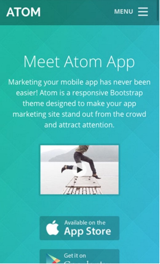
Photo credit: http://wrapbootstrap.com/preview/WB065NR19
Designers will create websites and apps that are even more “less flat.” This includes everything from the subtle textures in “flat color” backgrounds to drop shadows or gradients that lean a little more toward skeuomorphism.
Less-flat applies more to the overall layout while smaller elements (like icons) remain deeply rooted in pure-flat visuals. Just look at the background for the Atom App above: the overall color scheme is certainly based on the flat palette, but is formed from individual squares of graduated color.
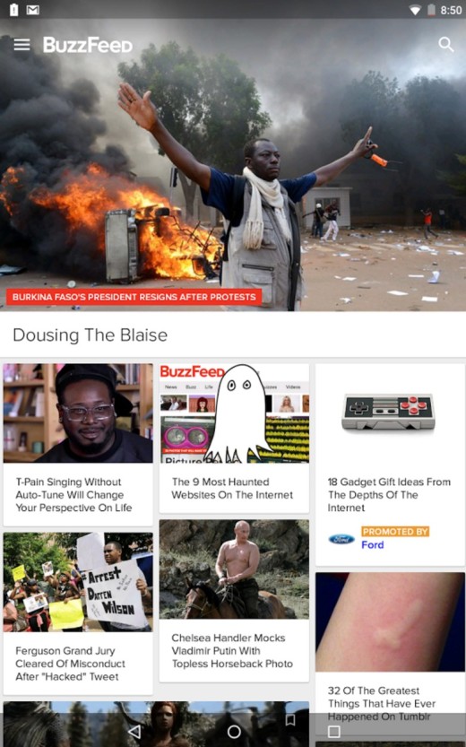
Photo credit: BuzzFeed App
Material design will continue to impact how designers approach to element layering along the Z-axis. There are already entire websites and plenty of Dribblers dedicated to creating and reimagining websites with material design.
For Buzzfeed’s app (above), you can see how material design gives the interface a more paper-like feel reminiscent of paper magazines. Because each card is “raised” above the grey background, the content feels inviting and fun to click. It’s the perfect blend of skeuomorphic familiarity and flat design elegance.
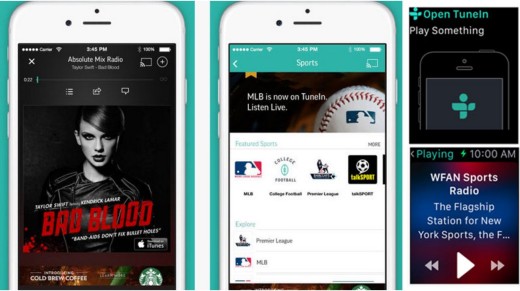
Photo credit: http://tunein.com/
And while it seems like many mobile devices are actually getting larger, flat design for mobile applications is getting smaller thanks to wearables. The flat aesthetic is practically made for this super small, super simple screen type since there’s zero room for skeuomorphic clutter. Flat might even see more growth as designers try to create wearable, mobile design interfaces that visually correlate to their responsive and app counterparts.
Because flat design is simple – we’re going all the way back to one thought, one screen here – it allows wearable users to get all the information they need at one glance. The TuneIn radio app (above) uses a highly visual interface with flat elements for its main app, but slims ways down for the wearable version with only an icon or simple alert text on the screen.
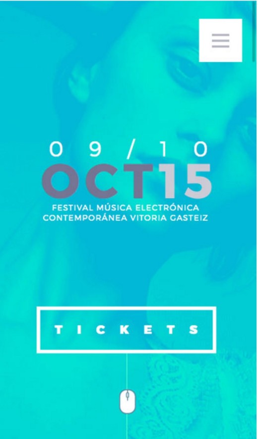
Photo credit: http://www.mugakofestival.com/
In the same way flat elements are used with photos, they can be used with video. More access to high-speed internet connections is making video a fast-growing mobile option. Adding flat elements, buttons or icons to video-based responsive sites or applications is stylish and functional.
The video elements for the Mugako Festival (above) are fun, fast and flat. (Just take a look at the aqua color paired with a ghost button.) Incorporating video in the background is an easy way to merge these trends without being overwhelming, and with as much video as we are seeing in website design as a whole, expect plenty more video in app design as well.
Flat design, like everything else in design, will continue to evolve, especially as more and more of us begin to use wearables.
For more useful mobile design techniques, check out the free guide Mobile Design Trends 2015 & 2016 by UXPin. 79 examples of outstanding mobile design from companies like Slack, Tinder, Waze, and others are deconstructed into simple design techniques. The book also includes 61 useful resources for mobile design.
Get the TNW newsletter
Get the most important tech news in your inbox each week.